The Art of Attraction: Creating a Landing Page that Property Sellers Can't Resist
Attracting property sellers to your real estate business is a fine art that begins with an irresistible landing page.
This digital handshake is your first opportunity to captivate sellers, making it a critical component of your property seller lead generation strategy.
But aesthetics alone cannot convert real estate sellers. Your landing page must strike a balance between visual appeal and user experience, ensuring a clean, intuitive, and mobile-friendly navigation.
As we delve further, we'll explore the power of compelling copy, effective calls to action, and the magic of continual testing and tweaking, all aimed at creating a landing page that property sellers simply can't resist.
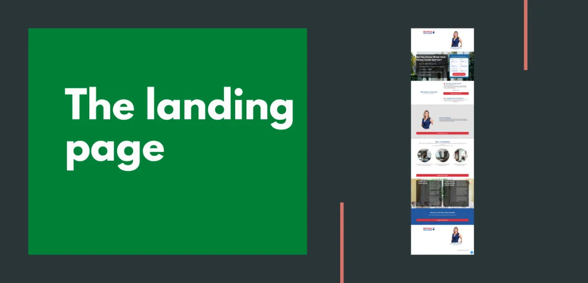
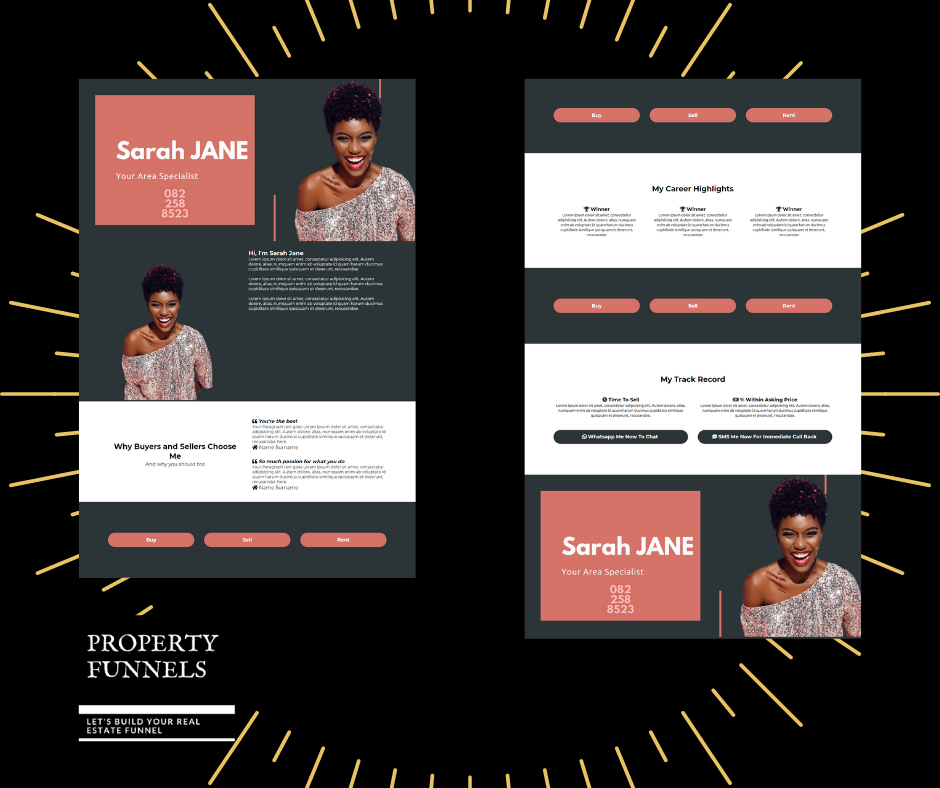
The best landing pages are more than just visually appealing - they are strategically designed with the user's experience at the forefront. They are clean, uncluttered, and intuitive to navigate. The use of attractive images, preferably of successful property deals, can instantly create a connection with the seller. The color scheme should be consistent with your brand identity, creating a sense of familiarity and trust.
First Impressions Count: Designing an Irresistible Landing Page

Remember, an average internet user has an attention span of approximately 8 seconds. Hence, the loading speed of your landing page can make or break the user experience. A smooth, swift loading page can keep a potential lead engaged, whilst a slow one might send them clicking away.
Moreover, ensure your landing page is mobile-friendly. With a majority of users accessing the internet via their mobile devices, a mobile-optimised page can vastly improve your chances of capturing a lead.
Creating an irresistible landing page is about striking the right balance between aesthetics and functionality. It should not only be visually compelling but should also provide a seamless user journey. A well-designed landing page can set the tone for the rest of the user's experience, ultimately leading to a successful conversion.
So, keep these tips in mind as you design your landing page. And remember, first impressions count.
Mastering the Message: Crafting Copy that Compels Property Sellers
As you've successfully designed a landing page that's visually appealing and user-friendly, it's time to take a deep dive into the heart of your landing page – the copy. This is the content, the message that you're trying to convey to your potential real estate sellers. Mastering this message is a critical step in your property seller lead generation strategy.
Crafting compelling copy is somewhat like writing a love letter to your property sellers. It needs to be engaging, persuasive, and most importantly, it needs to connect on an emotional level. This is your opportunity to show your sellers that you understand their needs, and that you're the best option to meet those needs.
Here's how to do it.
Firstly, know your audience. Understand who they are, what they want, and how they think. What are the fears, frustrations, and desires of a property seller?
What kind of language do they use? What kind of information are they looking for? Once you have these insights, you can write copy that speaks directly to them.
Secondly, focus on benefits, not features. Sure, your real estate service might have fantastic features, but what does that mean for the seller? How does it make their life easier or better? How does it solve their problems?
For example, instead of saying "We use advanced algorithms to price your property", say "We help you get the best price for your property, without the guesswork".
Thirdly, keep it simple and clear. Avoid jargon and industry terms. Your goal is to communicate, not to impress. Your sellers should be able to understand your message instantly, without having to think or decipher. Remember, confusion leads to inaction. So, be clear, be simple, and be direct.
Lastly, use powerful, action-oriented language. This is especially crucial for your headlines and calls-to-action (CTAs).
Words like "discover", "find out", "see why" can create curiosity and induce action. Your headlines should grab attention, create interest, and invoke a desire to read more. Your CTAs should nudge the seller to take the next step, be it filling a form, making a call, or scheduling a consultation.
And don't forget to proofread. Typos, grammatical errors, and awkward sentences can greatly undermine your credibility. So, always proofread (and preferably get someone else to proofread too) before you publish.
Crafting compelling copy is an art, one that can be honed with practice and feedback. It's not just about writing well, but about understanding the psychology of your audience and using words to influence and persuade. It's about creating a connection, building trust, and guiding the seller to the next step of their journey.
Call to Action Magic: Encouraging Engagement and Conversion

You've made a stellar first impression with a stunning landing page. You've crafted a compelling copy that connects with property sellers.
Now, it's time for some magic - the call to action (CTA). CTAs are an essential tool in your property seller lead generation strategy. They are the final push that urges the seller to take action, helping you convert real estate sellers.
Think of CTAs as the climax of your landing page story. You've set the scene with an attractive landing page, built up the plot with engaging copy, and now it's time for the grand finale: a well-crafted CTA can be the difference between a seller simply admiring your page and actually getting in touch with you.
The best landing pages use CTAs strategically. They are clearly visible, succinct, and action-oriented. They tell the seller exactly what to do next and why they should do it.
For example, "Schedule a free consultation to discover how we can sell your property faster and at a higher price". This CTA is clear, compelling, and offers a tangible benefit.
It's also important to limit the number of CTAs on your landing page. Too many can overwhelm the seller and dilute the impact of your main action. Stick to one primary CTA and use secondary CTAs sparingly, if at all.
Remember, each element on your landing page - the design, the copy, the CTA - is a piece of a larger puzzle. They need to work together seamlessly to guide the seller on a smooth journey from curiosity to interest to action.
So, don't underestimate the power of a well-crafted call to action. It's the magic ingredient that encourages engagement and drives conversion. With an effective CTA, your landing page can become a powerful tool that attracts and converts property sellers.
Next, we'll look at how to continually improve your landing page for success through testing and tweaking.
Testing, Tweaking and Triumph: Optimising Your Landing Page for Success
So, you've designed an eye-catching landing page, crafted compelling copy, and structured a persuasive call to action. However, the journey to optimise your property seller lead generation doesn't stop here. Testing, tweaking, and triumphing over your landing page is the next crucial step to convert real estate sellers.
The beauty of digital marketing lies in its ability to be dynamic and flexible. Unlike print or TV ads, online content can be adjusted in real-time based on performance. This allows you to continually refine your landing page for better results.
Split testing, or A/B testing, is a great way to start. This involves creating two versions of your landing page with one differing element. It could be the headline, the CTA, or the color scheme. By directing half of your traffic to each version, you can determine which performs better. The winning version becomes the new standard against which to test further tweaks.
Google Analytics and other similar tools provide invaluable insights into user behavior. Pay close attention to bounce rates, time spent on page, and click-through rates. These metrics can shed light on what's working and what's not, guiding your tweaking process.
Remember, even the best landing pages can always be improved. So, don't rest on your laurels. Keep testing, keep tweaking, and you'll keep improving your conversion rates. With perseverance and data-driven decisions, your landing page can become a powerful magnet that property sellers can't resist.
Up next, we'll discuss how to maintain a steady flow of traffic to your landing page.
The Perfect Facebook Ad to Get Sellers to Your Landing Page

In the grand scheme of your property seller lead generation strategy, creating a captivating landing page is only half the job. The other half is getting potential sellers to visit it. This is where the art of creating an enticing Facebook ad comes in. The right ad can act like a beacon, drawing sellers in and guiding them to your landing page.
Let's begin with the visuals. A picture is worth a thousand words, and in the case of Facebook ads, it might also be worth a thousand clicks. Choose an image or video that stands out, something that will make a seller pause while scrolling through their feed. It could be an impressive property you've sold, a satisfied client, or even a simple, clean image of your logo. The key is to be eye-catching and memorable.
Now, onto the ad copy. Just like your landing page, the ad copy needs to engage, entice, and persuade. It needs to speak to the seller's needs and desires, and it needs to do so quickly. Remember, social media users are generally scrolling fast, so your message needs to be clear and compelling.
Try our AI Tools to help you create better Facebook Ad copy
Start with a punchy headline that grabs attention. Something like "Sell your property fast and at a top price" or "Stress-free property selling with expert help".
Follow this up with a brief description that highlights the benefits of your service. Remember to focus on the seller, not on you. So instead of saying "We have a team of experienced agents", say "Get the expertise of seasoned agents working for you".
Include a clear, compelling call-to-action in your ad. Something like "Click here to find out more" or "Discover how we can help". Make sure the CTA leads directly to your landing page, providing a seamless journey for the seller.
Finally, take advantage of Facebook's targeting options. You can target your ad based on location, age, interests, and more. This allows you to get your ad in front of the right people, those who are likely to be interested in selling property.
However, don't set it and forget it. Monitor your ad's performance regularly, making tweaks and adjustments as needed. Which headlines are getting more clicks? Which images are getting more engagement? Use these insights to continually refine your ad and improve results.
Creating the perfect Facebook ad is an ongoing process of testing, learning, and tweaking. It's about understanding your audience, crafting a compelling message, and delivering it in a way that stands out. Done right, it can drive a steady stream of sellers to your landing page, boosting your lead generation and conversion results.
Remember, your landing page and your Facebook ad are two sides of the same coin. They need to work together, each enhancing the other, to create a seamless, engaging journey for the seller. So, invest time and effort in both, and watch as your lead generation machine kicks into high gear.
In the next section, we'll explore how email can drive traffic to your landing page. Stay tuned.
The Perfect Email to Drive Traffic To Your Landing Page

The perfect email to drive traffic to your landing page is a delicate dance of persuasion and relevance. It's your chance to make a connection with property sellers, to show them you understand their needs and can provide the solution they're seeking. It's also an integral part of your property seller lead generation strategy.
Start with a compelling subject line. This is your first impression, the hook that entices the reader to open your email. It should be short, punchy, and intriguing. Consider using personalisation, like the recipient's name or location, to make it more engaging.
A good subject line like "Maximise Your Property Value with Us", "Sell Your Property Faster and for More", or "Discover the Secret to Quick, Profitable Property Sales".
For instance, if your email is about a new service you're offering to help property sellers get the best price, your introduction could be something like, "Are you tired of settling for less than your property's worth? We have a solution that could change everything for you."
If your email is about a success story of a client who sold their property quickly and profitably with your help, the introduction could be, "Ever wondered how Mr. and Mrs. Smith sold their property in just two weeks and at 20% above the market value? We're about to reveal the secret."
Or if your email is about an upcoming webinar on profitable property selling strategies, the introduction could be, "Want to uncover the secrets of successful property selling? Join our exclusive webinar and learn from the industry's best."
Each of these introductions gives a brief overview of what the email will cover and why it should matter to the reader, effectively grabbing their attention and sparking their curiosity.
In the body of the email, you should clearly articulate your value proposition. For instance, you could say, "Our team of experienced real estate professionals has a proven track record of selling properties 30% faster than the market average." This statement directly addresses the seller's need to sell their property quickly and shows why you are the best choice.
You could also highlight unique services or features that set you apart from competitors. For example, "We offer a comprehensive marketing package for your property, including professional photography, virtual tours, and targeted online ads." This showcases your value proposition and how it aligns with the seller's needs.
Remember to use persuasive, action-oriented language. Instead of saying, "We can list your property," say "Let us catapult your property onto the market with our top-tier listing services." This is more compelling and encourages action.
However, keep your language simple and clear. Avoid using industry jargon like 'CMA' without explaining what they mean. Instead of saying "We'll conduct a CMA," say "We'll analyse recent sales in your area to determine the best price for your property."
By following these guidelines, you can craft an effective body for your email that showcases your value proposition, aligns with the seller's needs, and persuades them to take action.
Include a clear, compelling call-to-action (CTA) that leads directly to your landing page. This could be something like "Find out how we can sell your property faster and at a higher price". The CTA is your final push, urging the reader to click through and visit your landing page.
Finally, always remember to personalise your emails. Personalisation can increase click-through rates and conversions by making the reader feel valued and understood. Use the recipient's name, reference their location, or mention a recent interaction.
A well-crafted email can be a powerful tool to drive traffic to your landing page, helping you convert real estate sellers. But remember, the key to a successful email campaign is continuous testing and tweaking. Monitor your open rates, click-through rates, and conversion rates. Use these insights to refine your emails and improve results.
Conclusion
In conclusion, an irresistible landing page is the linchpin of your property seller lead generation strategy.
It marries aesthetics with functionality, compelling copy with strategic CTAs, all while ensuring a seamless user experience.
Coupled with a well-crafted Facebook ad and personalised emails, it becomes a powerful magnet that attracts and converts real estate sellers.
Remember, the key to success lies in constant testing, tweaking, and optimisation. So, keep refining, keep improving, and you'll soon have a landing page that property sellers simply can't resist. Stay tuned for more insights on driving traffic to your landing page.
If you're interested in learning more about how Property Funnels can assist you in each area, we strongly encourage you to reach out to us.
Our team is always ready to provide detailed information and answer any questions you may have. Don't hesitate, contact us today and let's explore how we can make your property selling journey easier and more profitable.


